The 5 Minute Accessibility Strategy
David Crawford / May 18, 2023
If you were asked right now to scope out a baseline of accessibility needs in your app, with details on how to implement them, could you articulate a plan in 5 minutes? Whether you have an already existing project, or a brand new app you're working on, accessibility can sometimes be a daunting topic. At Michigan Labs, we have projects that specifically target users who need these features Because of this, accessibility has become more and more important to us. I wanted to share this post with you, in case you need a plan quickly, and aren't sure where to start. This won't be comprehensive, but will touch on some of the major elements in order to give you a good, technical starting point. We'll cover the following areas, which are platform agnostic, but also their React Native implementations as an example:
- Text Scale
- Screen Reader Text
- UI/UX Responsibility
Text Scale
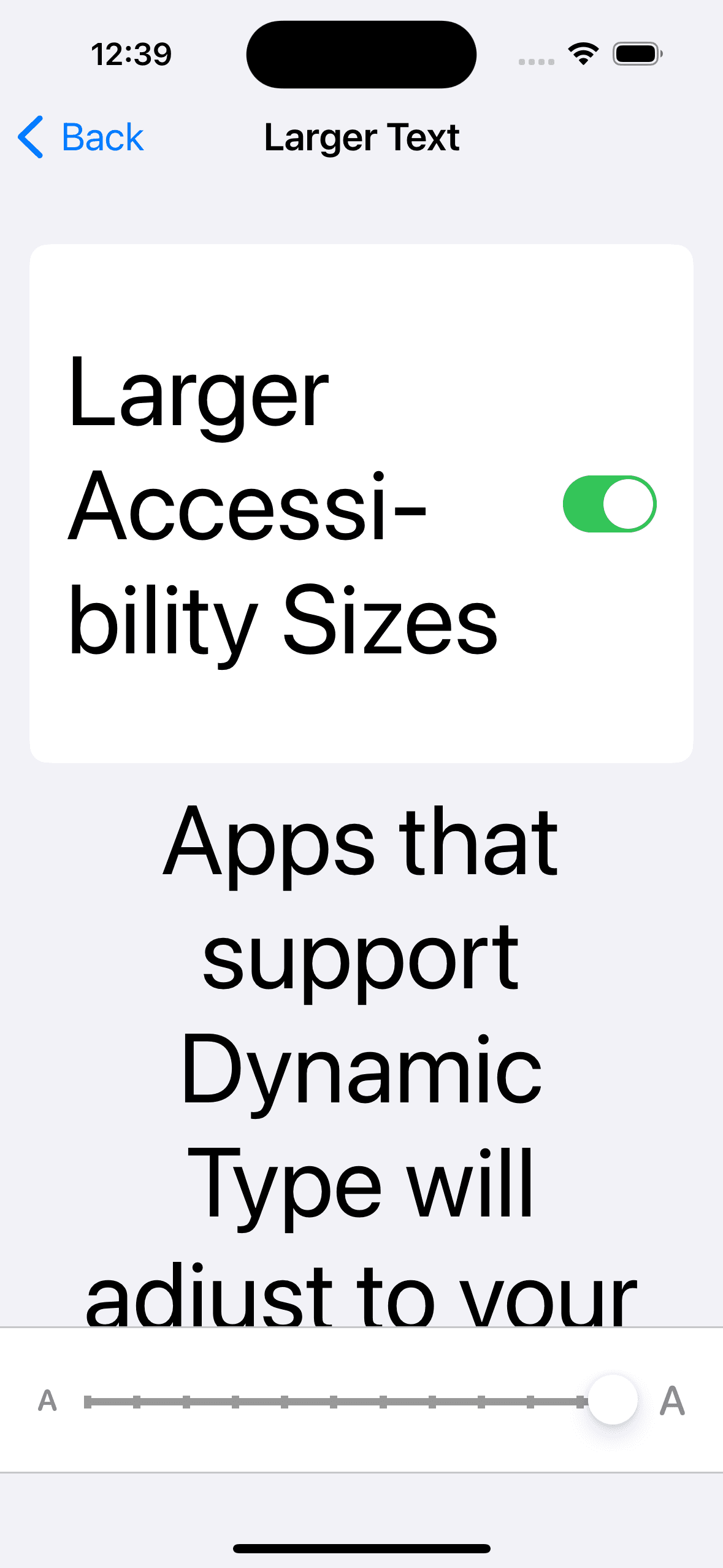
From my personal experience, the broader your user base gets, the more users you'll find that set the universal text scale feature on their phone to the absolute maximum, or anything above the default.
This feature is available to help overcome low visibility across the entire OS. If you're not prepared for handling it, these universal settings could override your UI and give the user a bad experience. How can we be prepared for this?
In React Native, for all <Text> components, we must use the following props where applicable:
There are others, but these are the most basic props that have the most impact. What this is not, is a way to just ignore all of the font scaling accessibility settings. We don't want to do this, but instead add a buffer of space in our UI, so that the user can increase/decrease font scaling to a moderate degree without breaking the experience.
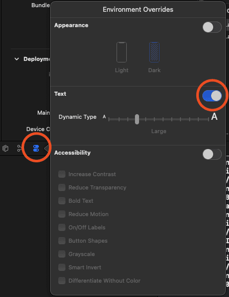
After you've added these measures to control font scaling, how can we test this easily? In your simulator, you can typically just update the font scaling in the accessibility settings for the OS.
However, in iOS you can do this live via these steps:
- Run the app using Xcode
- Locate the log bar near the bottom of the screen
- Open the
Environment Overrideswindow - Adjust the slider accordingly
Screen Reader Text
Supporting a screen reader in your app has a few benefits beyond just accessibility for the visually impaired:
- It adds natural descriptions to the code in various elements of the app, which helps with onboarding or understanding the practical use-case of a component
- It forces us to better organize complex interactive structures, like forms or grouped controls
In order to properly support screen readers, we must use the following props:
- accessible= - This indicates that a component is an accessibility element, and its children are intended to be grouped into a single selectable component. Consider the following:
<View accessible="{true}">
  <Text>text one</Text>
  <Text>text two</Text>
</View>
In this case, the children are intended to be grouped together. The screen reader won't focus separately on each child.
- accessibilityLabel=Some label - This is the text that will be read by the screen reader. By default, if you don't include this prop, the screen reader will instead concatenate all
<Text>children. Consider these examples:
Here, the screen reader will read "text one text two".
<View accessible="{true}">
  <Text>text one</Text>
  <Text>text two</Text>
</View>
Here, the screen reader will read "A text area".
<View accessible="{true}" accessibilityLabel="A text area">
  <Text>text one</Text>
  <Text>text two</Text>
</View>
- accessibilityHint=Some hint - Hints are read by the screen reader after the label. They're intended to tell the user what the result of an action will be.
- On iOS, hints can be turned off in the VoiceOver settings
- On Android, hints cannot be turned off
Extra Notes
- Touchable components such as
TouchableOpacityare by default set toaccessible={true} - For a group of components, use the
accessibleprop on the parent to group the children into a single "selectable" component
UI/UX Responsibility
There are many ways to implement more accessibility features in an app, such as accessibilityIgnoresInvertColors to help with photos when the OS color mode is inverted. However, the need for some of these must be clarified by designers, and not assumed as a requirement for developers.
Typically, we can assume the following areas are already being addressed in our designs, unless there's specific concerns:
- Color contrast
- Fonts
- Default text sizes
- Colorblind friendly design
Conclusion
If you incorporate these basic accessibility features into your app, you'll have a great foundation and baseline that covers a large portion of user needs. Beyond this, it will depend on your own use-cases, and how deep you need to adhere to standards like WCAG.
WCAG is an accessibility standard for web content, however this doesn't translate 1:1 with mobile development. Because of this, WCAG published guidelines to help bridge this gap.